
Friday, January 20, 2006
Fixed it!!
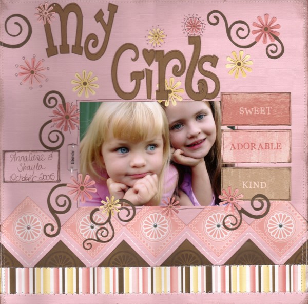
Well, as you can see I've fixed it up. I managed to get the 'r & l' up and then used my glue eraser to get rid of most of the glue that was left on the cardstock, but it did leave some marks, hence the flower under the 'r'. I had to print out a new r and l and I did them a bit big, but I think it looks ok. I also added some machine stitching and some pen work!
Thanks to everyone that commented on my first attempt and mistake!! And yes Shazz, I've nearly done the 'angel' 'angle' one a few times!LOL
And I must be the worlds worst scanner, my layouts always look wonky!LOL
Have a good night everyone! Off to watch the tennis now!!!
Comments:
<< Home
well it looks fine to me chris....but then again i could see nothing wrong with the first version until my kait pointed it out......ROTFL
p.s. *note to self* - GET EYES CHECKED !!!
p.s. *note to self* - GET EYES CHECKED !!!

Well done on the fix up!!! The colours scanned heaps better in the new one and it looks even better!! Gorgeous LO Chris!!
ROTFL Chris!! I have done things like this many a time! You've recovered beautifully, no one will ever know! (unless they read your blog lol)
SUPER layout Chris and I love the placement of those WA words LOL....great minds think alike...and isn't it TRUE :0)
JULIEx
JULIEx
# posted by  : 7:38 AM
: 7:38 AM
Exceptional as usual Chris!!!
I got a chuckle from your lasts couple of posts!!! You have showcased scrapbooking at it's best!! (There are no such things as mistakes!! LOL)
Love this Chris!!! & Love the colours!!!!
Cheers
Michelle
Looking foward to your next work of art with anticipation!!!!!!!
I got a chuckle from your lasts couple of posts!!! You have showcased scrapbooking at it's best!! (There are no such things as mistakes!! LOL)
Love this Chris!!! & Love the colours!!!!
Cheers
Michelle
Looking foward to your next work of art with anticipation!!!!!!!
Just lovely Chris, nice rebound, i would have been....ticked!
Love the whole layout though, just recently found your blog and am enjoying it.
Veronica
Love the whole layout though, just recently found your blog and am enjoying it.
Veronica
# posted by : 12:26 PM
: 12:26 PM
You did recover beautifully!!! I think the "Fixed" version just has the little bit extra around the title & looks really cool. I loved the first one, but this is even better. See tennis & scapping do mix ;-)
Awesome fix up job Chris roflrofl..yep, I've done silly things like that before too. It's all about how well you can recover from them lol.
DOH!!! hate it when that happens.
It took me a while to pick up what mistake you had made lol!!!
The new re-vamped page looks great, I love the PP.
laters
M
It took me a while to pick up what mistake you had made lol!!!
The new re-vamped page looks great, I love the PP.
laters
M
I like the extra flowers and 'bits' around the title - populates that space nicely. Congrats, it's fun to see both versions and how your page developed!
Post a Comment
# posted by : 4:25 PM
: 4:25 PM Subscribe to Post Comments [Atom]
<< Home
![]()
Subscribe to Posts [Atom]